New or Old PS3 box art logo?

LordKefka06

CAGiversary!
What top/spine do you guys like better?

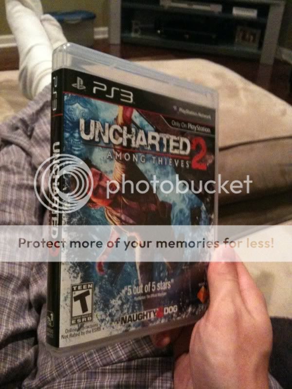
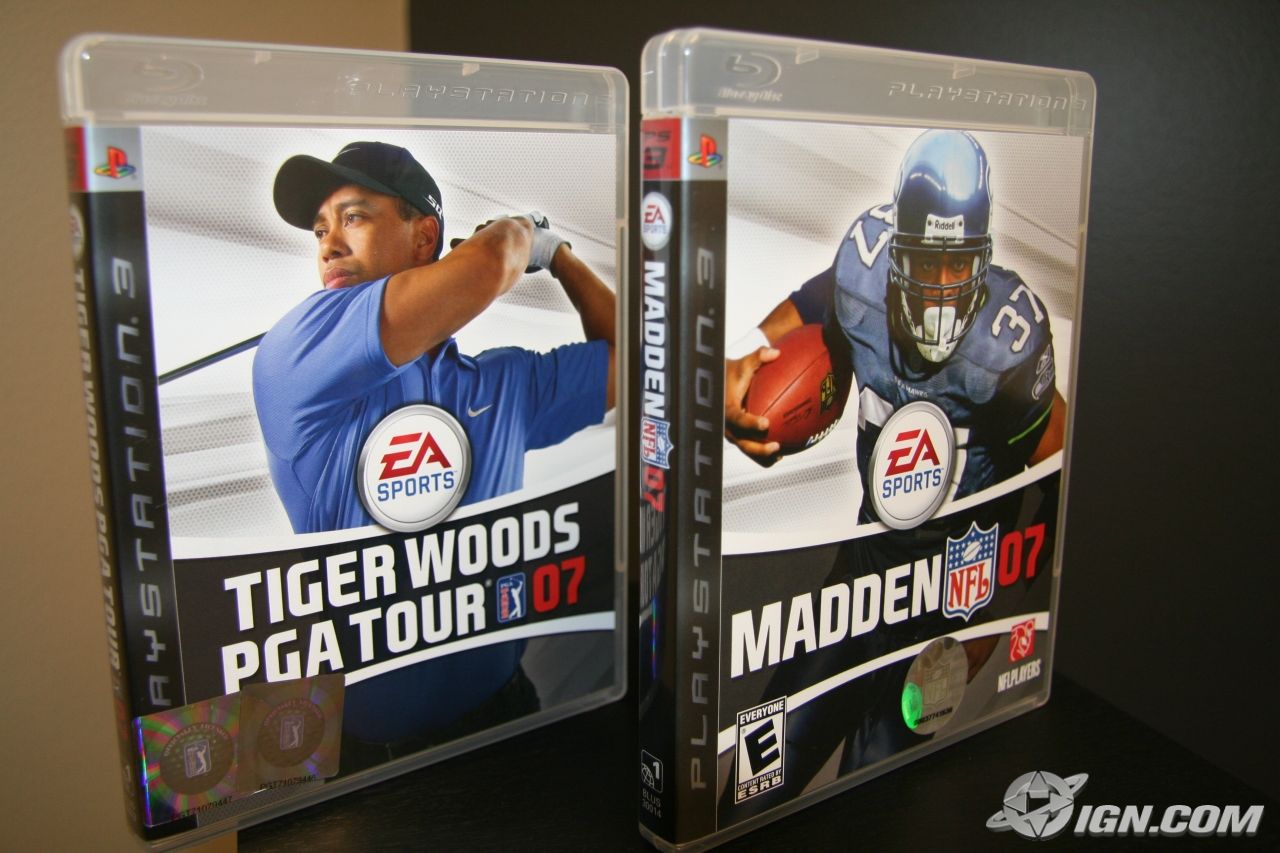
Here's a few pictures of each:

New:
uncharted2spine.jpg
3881280273_255c8f87aa.jpg

godofwar_1251922996.jpg
uncharted2spine.jpg
1tpzlh.png
PS3-Greatest-Hits-Box-MCLA.jpg

Old:
13793_playstation_3.jpg

first-ps3-game-case-shots-20061103110111559.jpg
Ghostbusters-The-Video-Game-Front-Cover-661.jpg

kmart.jpg

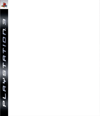
PS3-Game-Cover-psd33067.png

Comparison:
500x_uc2box.jpg


1001090948a.jpg

photo0048f.jpg

500x_ps3logos.jpg
 
Last edited by a moderator:
I personally prefer the new logo. It looks more slim & sleeker. Plus you get more cover artwork since you don't have the vertical "Playstation 3" on the left side.
 
I fucking hate the new one. Doesn't the old have more space for art? Look at Uncharted 2, the covers are identical except Drake's hand is missing in the new art. Lame.
 
Poll seems 50/50 right now. I really like the new box art style. They kept the more old school PS2/PSP look with it. I wish Tekken 6 came with the cover style.
 
dammit i didn't know they changed it. I hate the new covers especially the bar on top, feels like it shrinks the picture... greatest hits covers look better than the new, atlest it has a thinner bar up top.
 
I hate the new spine, only because now my games are going to look all mismatched on my shelves. Plus, I've always liked the Spiderman font... it's sad to see it go. :(
 
I do it like this: (From Right to Left)

Old PS3 boxes
New PS3 boxes
GH boxes (I have none of these)

But the new Spine is really dumb because of the drop down.
 
Can you post the Greatest Hits art for the new box style?

Look at Midnight Club: Angeles - The Complete Edition for it
 
was never a fan of the old version's spine (red was too conspicuous), but I prefer the layout on the front to the new one. Or maybe I just prefer the font, I'm not sure. Neither was/is spectacular.
 
Its like the transfer from the old long boxes to the CD cases with the original PlayStation games.
 
[quote name='KingBroly']I do it like this: (From Right to Left)

Old PS3 boxes
New PS3 boxes
GH boxes (I have none of these)

But the new Spine is really dumb because of the drop down.[/QUOTE]That's pretty much what I do, organize my PS3 boxes that way.

I prefer the newer ones overall. The front and back of the PS3 cases, I'm mixed. However, the new spine on the side is WAY better IMO.
 
The new ones. The Spiderman font was a terrible choice and it looked incredibly tacky. The new covers are an improvement but there is too much on the top of the box art. The new logo is much better, it has more of a Wii look to it (which I'm sure is not a coincidence).
 
[quote name='the_punisher']The new looks better, but it sucks that they changed it a couple of years into the console's life cycle.[/QUOTE]Sony changed PS1 cases and Sega changed DC cases. That's why I see no problem. Sony pretty much had to change the PS3 cases because Sony needed to completely re-brand PS3. What they did seems to be working very well.
 
I prefer the old one, but the new one isn't terrible. The spine actually looks better to me and I understand the need for the placement and the use of PS3 as it stands out more to consumers. As others have said, unfortunately it doesn't merge well with the previous purchases games in my collection.

I think the way Sony has launched the Slim has been impressive. Excellent marketing campaign and a nice redesign of the console and box art.
 
[quote name='Tyga24']I think the way Sony has launched the Slim has been impressive. Excellent marketing campaign and a nice redesign of the console and box art.[/QUOTE]Yeah, they finally are using commercials that are focused to the mainstream. Not just people with good video game backgrounds.
 
The old, just becuase I seriously fucking hate that new PS3 slim bubble font. I really, REALLY hate that font. My gut actually twisted when I upgraded my firmfare and realized I'd have to look at that during startup now, then though it's only for a few seconds. Never minded the spidey font.

(And yes, I realize it's a stupid thing to get worked up over... but for some reason,as far as systems go, the little details set me off more than anything that really matters.)
 
[quote name='FroMann']Its like the transfer from the old long boxes to the CD cases with the original PlayStation games.[/QUOTE]

I had forgotten that one. The long boxes were already gone by the time I had gotten a Playstation though. That one WAS a good change.

The Dreamcast one was annoying. This one is less so.
 
[quote name='niceguyshawne']I hate it when they redesign boxes mid-generation.[/QUOTE]

This with a caveat.

The Sega Genesis switch to the red borders was awesome. It really made the whole Sega section in stores stand out in the mid 90s with purple borders for Game Gear games, red borders for Genesis games, yellow borders for 32x games, and blue borders for Sega CD games.

:(
 
[quote name='Halo05']This with a caveat.

The Sega Genesis switch to the red borders was awesome. It really made the whole Sega section in stores stand out in the mid 90s with purple borders for Game Gear games, red borders for Genesis games, yellow borders for 32x games, and blue borders for Sega CD games.

:(
 
[quote name='DuelLadyS']The old, just becuase I seriously fucking hate that new PS3 slim bubble font. I really, REALLY hate that font. My gut actually twisted when I upgraded my firmfare and realized I'd have to look at that during startup now, then though it's only for a few seconds. Never minded the spidey font.

(And yes, I realize it's a stupid thing to get worked up over... but for some reason,as far as systems go, the little details set me off more than anything that really matters.)[/QUOTE]

You mean when I update I'm going to have to look at that STUPID fucking logo every time?! Why not just give people a choice between the two?! X-(
At least Sony can't run in and fuck around with my console at home and force that UGLY matte finish as well as the logo.
I wouldn't mind the new box art if they had it resemble the PSP's instead, those sharp angular lines. The bubbled up one just looks terrible.
 
Got my first set of "new" boxes.

Looks pretty shitty on Uncharted 2, but I have to say, my GH copy of Midnight Club looks mighty fine.

Thus, Old > New. New GH > Old GH.
 
[quote name='willardhaven']I just don't get how anyone could like the Spiderman font with Photoshop spotlight filters along the side.[/QUOTE]

Because it's not as tacky? It also doesn't remind someone of a console redo that looks like shit. Seriously the matte finish just helps add to the image that the PS3 Slim looks cheap. The disc slot is terrible looking. They could've at least found some way to keep the cool chrome thing. They also could keep the black finish there too instead of that white which just looks off.
 
[quote name='asaraa']New. And I wish all the cases were always red, not just Greatest Hits.[/QUOTE]

When they print art on the back side of the cover I appreciate a clear case (for example Uncharted or Ratchet & Clank Tools of Destruction).
 
[quote name='MSUHitman']New logo sucks. Also pissed they took the disc bootup logo out of games; that's been a Sony trademark since the PS1 days.[/QUOTE]

You mean the the one that pops up on PS2 games? PS1 just has the SCEA white screen that turned into a multicolor PS1 screen.
 
[quote name='willardhaven']You mean the the one that pops up on PS2 games? PS1 just has the SCEA white screen that turned into a multicolor PS1 screen.[/QUOTE]

I believe they mean the PS3 logo screen that was coming up prior to the 3.0 FW update that added the sparkly bullshit to the background. The one that came up when you loaded a disc up on the PS3.
 
[quote name='MSUHitman']New logo sucks. Also pissed they took the disc bootup logo out of games; that's been a Sony trademark since the PS1 days.[/QUOTE]Sony is trying to get rid of the Spiderman font forever, since they feel it was cursed. Since other platforms don't have any disc bootup and sold much better, that's partially why Sony felt the need to just remove it.

The main reason for the new logo was because Kaz noticed during multi-platform commercials, the PlayStation 3 logo was tough to read while the 360 logo jumped right out. It was because the long PlayStation 3 font would shrink a bit too much. By Sony going to fewer letters, it would make the commercial/advertisement more clear to average consumers the game is on PS3. The new PS3 logo kind of catches the eye more than the 360 logo and does seem to be working so far.
 
[quote name='The Mana Knight']Sony is trying to get rid of the Spiderman font forever, since they feel it was cursed. Since other platforms don't have any disc bootup and sold much better, that's partially why Sony felt the need to just remove it.

The main reason for the new logo was because Kaz noticed during multi-platform commercials, the PlayStation 3 logo was tough to read while the 360 logo jumped right out. It was because the long PlayStation 3 font would shrink a bit too much. By Sony going to fewer letters, it would make the commercial/advertisement more clear to average consumers the game is on PS3. The new PS3 logo kind of catches the eye more than the 360 logo and does seem to be working so far.[/QUOTE]

Actually, I believe it was the price drop that caught people's attention much more than some newer logo. Plus, the commercials actually 'pimp out' that fact and don't confuse the ever living shit out of consumers(like the crying doll commercial).

As for the lack of a boot screen, it doesn't matter one bit to me, though the addition of 'sparkles' to the background of the XMB was a laughable addition. How about adding a mini game to go with those sparkles?

As for the "Spiderman" font being cursed, it was Sony's initial high pricepoint that curse them this gen. Luckily, they have taken steps towards fixing that(price drop). Hopefully, it's not too late for them to catch up in sales.
 
bread's done
Back
Top