
You are using an out of date browser. It may not display this or other websites correctly.
You should upgrade or use an alternative browser.
You should upgrade or use an alternative browser.
Dark and Light Themes are Coming to CAG 3.0 - Preview Inside
- Thread starter CheapyD
- Start date
FriskyTanuki
CAGiversary!
- Feedback
- 36 (100%)
The rest of the page looks much darker than CAG currently is, so that needs to be tweaked.
[quote name='Mixer236']That particular shade of green doesn't really bother me. However, I think you'll wind up having people complain about any shade of green, just because it's green.[/QUOTE]
I actually like green, but not brighter shades of it.
If it's not too much effort, maybe one with a darker green and a different one with a lighter green. Though I think the CAG logo would go good over the IPS Community part, eliminating a good portion of the green.
I actually like green, but not brighter shades of it.
If it's not too much effort, maybe one with a darker green and a different one with a lighter green. Though I think the CAG logo would go good over the IPS Community part, eliminating a good portion of the green.

Necrozilla
CAGiversary!
- Feedback
- 32 (97%)
White makes it easier to browse at work. Less inconspicuous.
 s Get the in out.
FriskyTanuki
CAGiversary!
- Feedback
- 36 (100%)
That green is a bit overpowering, even on a white background. On the current CAG, green is all over the place despite only being used for borders and text so that it doesn't overwhelm. More orange or a darker green might be a good idea, especially on the white skin since you can barely see the borders on posts.
DurbanBrown
CAGiversary!
- Feedback
- 61 (100%)
light blows, reminds me of apple ipad or something. DARK FTW
ShockandAww
CAGiversary!
- Feedback
- 110 (100%)
Honestly I think the green/orange looks pretty terrible. And I say that after editing repeatedly to make it sound nicer. It's like Halloween at CAG every day.
And if we can have a choice of both, then you should just do both and make it an option when joining the site as to which is preferred by the individual (if that's possible).
And if we can have a choice of both, then you should just do both and make it an option when joining the site as to which is preferred by the individual (if that's possible).
Here's another shot at a Light version, with green regulated to a trimming duties:
http://www.flickr.com/photos/cheapyd/6034340878/
CAG 3.0 Light Draft by CheapyD, on Flickr
http://www.flickr.com/photos/cheapyd/6034340878/
CAG 3.0 Light Draft by CheapyD, on Flickr
shrike4242
CAGiversary!
- Feedback
- 1043 (100%)
Light one is Jedi, dark one is Sith?

ShockandAww
CAGiversary!
- Feedback
- 110 (100%)
Yeah Cheapy personally I like that last light one the best. Like I said though I'm not a big fan of much green or orange so maybe others like the other ones better.
Also I think that orange (and maybe the green too?) looks better there because of that gray.
Also I think that orange (and maybe the green too?) looks better there because of that gray.
[quote name='antlp89']By the way, did not realize Cheapy spoke French. ") [/QUOTE]
[/QUOTE]
I'd be afraid of Programmer John putting the number 34 as the quote to that post. Also just a guess, but I'm pretty sure that it's Latin and not french. I also doubt he speaks it.
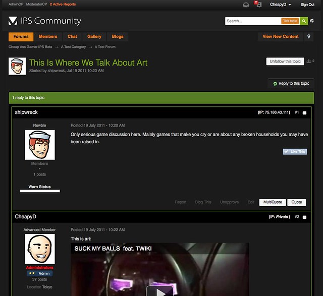
The light theme does look pretty decent now as plain white is usually a bit too bright to stare at/read. I still hope that the large green bar gets changed in the dark theme where it says "1 reply to this topic" as it's my only real gripe.
[/QUOTE]I'd be afraid of Programmer John putting the number 34 as the quote to that post. Also just a guess, but I'm pretty sure that it's Latin and not french. I also doubt he speaks it.
The light theme does look pretty decent now as plain white is usually a bit too bright to stare at/read. I still hope that the large green bar gets changed in the dark theme where it says "1 reply to this topic" as it's my only real gripe.
packerfan10
CAGiversary!
I get to much sunlight here in So Cal. I enjoy the rare cloudy and dark days. Keep it dark the light is way to bright.
[quote name='antlp89']By the way, did not realize Cheapy spoke French. [/QUOTE]
Not sure if serious, but just in case: http://en.wikipedia.org/wiki/Lorem_ipsum
[/QUOTE]Not sure if serious, but just in case: http://en.wikipedia.org/wiki/Lorem_ipsum
eldergamer
CAGiversary!
[quote name='Rocko']Not sure if serious, but just in case: http://en.wikipedia.org/wiki/Lorem_ipsum[/QUOTE]
Well, I learned something new today. Thank you.
The page on http://en.wikipedia.org/wiki/ETAOIN_SHRDLU is interesting too. My dad used to have a print shop and old fashioned letterpress.
Well, I learned something new today. Thank you.
The page on http://en.wikipedia.org/wiki/ETAOIN_SHRDLU is interesting too. My dad used to have a print shop and old fashioned letterpress.
Ionotropic
CAGiversary!
- Feedback
- 15 (100%)
Thanks for keeping the darkness available (I love green and orange text, too)! Light theme hurts my eyes.
bread's done