
UPDATE: The tribe has spoken! There will be both light and dark versions of the new CAG.
Here are the current draft versions of each:
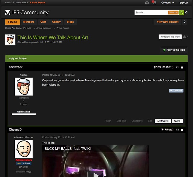
CAG 3.0 Dark Theme Late Draft by CheapyD, on Flickr

CAG 3.0 Light Draft by CheapyD, on Flickr
Here are the current draft versions of each:
CAG 3.0 Dark Theme Late Draft by CheapyD, on Flickr
CAG 3.0 Light Draft by CheapyD, on Flickr
Last edited by a moderator:
