
You are using an out of date browser. It may not display this or other websites correctly.
You should upgrade or use an alternative browser.
You should upgrade or use an alternative browser.
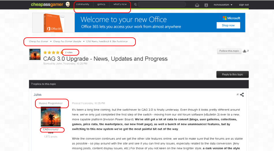
CAG 3.0 Upgrade - News, Updates And Progress - Dark Theme, Feedback are Live - EVERYTHING is Coming Back Soon!
- Thread starter John
- Start date
- Status
- Not open for further replies.
How? All I see is the big search bar. Searching that does bring up certain threads with hits. But can it display individual posts in a thread that where hits yet? Couldn't figure that out.Search is hooked into the game database pretty tightly, so it's disabled until that part of the site is up. In-thread searching works though.John is there supposed to be an advanced search option next to the search bar? I'm not seeing it. Not sure how to search a specific thread or if the option just isn't up yet.
Sorry, I meant it'll work the way you expect once the game db is live.How? All I see is the big search bar. Searching that does bring up certain threads with hits. But can it display individual posts in a thread that where hits yet? Couldn't figure that out.
Have you tried messing with your browser's zoom? It's a little better. We definitely need a dark theme but it's coming.I don't think most people agree with me, but the new format is fugly and hard to browse. Text stood out a lot more in the previous iteration.
Last edited by a moderator:
slickkill77
CAGiversary!
- Feedback
- 78 (100%)
Do not like this at all.
DealSeeker2U
Banned
Just a suggestion to programmers, adminstrators and mods once all the major things are taken care or, if they can add emoticons for consoles; retro, current and new (when the new ones are out). We don't even have the emoticons for PS1, N64, Wii U, vita, among some others. It would be nice to just type  and get something like
 . Just a suggestion.
Also, please bring back the deals sidebar with top 15 (or top 10 as it used be) deals listing as it was really helpful to just glance and know what was happening here at CAG. Thanks!
and get something like
Also, please bring back the deals sidebar with top 15 (or top 10 as it used be) deals listing as it was really helpful to just glance and know what was happening here at CAG. Thanks!
Last edited by a moderator:
Cool thanks.Sorry, I meant it'll work the way you expect once the game db is live.How? All I see is the big search bar. Searching that does bring up certain threads with hits. But can it display individual posts in a thread that where hits yet? Couldn't figure that out.
badass_gamer
CAGiversary!
Will the new format still have specific game price tracking with notifications? This is my favorite part about CheapAssGamer.
Sgt Barone
CAGiversary!
Thank you for toning down the brightness John!
And the font is perfect on iOS, John.
Yes, new and improved.Will the new format still have specific game price tracking with notifications? This is my favorite part about CheapAssGamer.
And the font is perfect on iOS, John.
Last edited by a moderator:
gpgorbosjr
CAGiversary!
- Feedback
- 4 (100%)
Great, thanks for the quick response. I was very nervous it wouldn't be supported. I've left forums because they refuse to support it. I'm always on my phone.Tapatalk support is back, but because the location of the forums has changed we have to wait for the URL to update in their directory. Should be about an hour, apparently.
shrike4242
CAGiversary!
- Feedback
- 1043 (100%)
It's forthcoming and has been asked numerous times in the thread.Hi, Id like to request a way in our settings to use the Dark theme, I find the new bright theme to be blinding for me on my laptop. Congratulations on the upgrade to Cag 3.0, thanks as a Cagger for your hard work and dedication.
That's one of a number of changes that are in-process and should be taken care of in the next few days to a week.
The font does look a lot better although there is still an issue with quoted names. They are so small and bold that some of the characters tend to lose enough space that they are harder to read.
Also I am unsure if it is simply a theme issue, but there is apparently a background graphic. I wouldn't have noticed it had I not been looking at my screen at such an extreme angle. Seems a little pointless to have a graphic that nearly blends seamlessly into the overall color of the page.
Also I am unsure if it is simply a theme issue, but there is apparently a background graphic. I wouldn't have noticed it had I not been looking at my screen at such an extreme angle. Seems a little pointless to have a graphic that nearly blends seamlessly into the overall color of the page.
Last edited by a moderator:
I was messing out with the skins and looks like the Dark Custom theme hasn't been released yet, but the normal Invision Power Board skin the blue skin is still present, and on Firefox it doesn't have any problems at all with text and doesn't hurt your eyes, I think that the guy who programmed the site should let a little blue come out for Firefox users, because it will help them outNot sure if has something to do with my resolution or what not, but the text/font used looks like crap.
See here, lowered size a bit, but that's how it looks on my laptop running native 1280x800.
If you are using Chrome at the moment this is the best fix that you can get.
http://www.cheapassgamer.com/topic/309770-cag-30-to-old-colors-back-for-chrome-tutorial-firefox-next/
but testing on firefox and messing with the data shows to me that CheapyD or the guy who implemented didn't want us to go and see blue everywhere he must have hated the intro of Iron Man 3
Jrittmayer
CAGiversary!
- Feedback
- 9 (100%)
Exactly, image limits definitely need to be increased. 2 images per sig at the very least. If people don't want to see signatures, then give them the option to hide them (I think this options already there).True. It wouldn't necessarily "benefit all of CAG". But at the same time, I think removing the sense of personalization is a mistake. Let's be honest, there's hardly ever a reason to look at somebody's profile. I never do it. Hell, I barely ever look at my own. Signatures and avatars are the most common way to give your CAG presence a little personality. And on a site dedicated to gaming, where the majority of members have multiple systems, it seems silly to not be able to display statistics for those systems. I really hope this is just a temporary limitation until the full site is up.Yeah, I went to edit my signature with a smaller XBL gamercard to get all on one row, and found out that there was a 1 image max, so it won't let me add the smaller gamercard. So I guess I'll just stick with what I have now. Seems like most of us who have multiple images have been grandfathered in, but I guess that benefit could end at some point. But I wouldn't mind the image limit being bumped up to 2, but that's just a personal greedy request rather than something that would benefit all of CAG.So, it seems my "personal messenger" box is full, as it's showing 100%. The weird thing is, messages that I deleted before the upgrade are back again (but show as "deleted"). Even new messages I've tried deleting will show as "deleted" but seem to still count toward my capacity.
Also, I noticed that signatures can only include one image now? Obviously, that's really going to limit what I've got going on. But it seems kind of sucky that people can't even have a couple gamercards in their signature (ie. XBL card, Steam card, etc). I get that there's still a lot to be updated, and I can appreciate what a huge undertaking this is. I just hope we're not getting "Microsofted" here...where a bunch of features are being added that nobody even asked for. Meanwhile, legitimate features that people used and liked are being gimped.
Also, I don't like that when I quote your post, it also quotes mine before it. If the goal is streamlining and making things more efficient, this doesn't seem like a good way too accomplish it. Just makes everything more jumbled and cluttered. If I wanted both posts quoted, why wouldn't I just click "multi-quote"?
Also, please don't put stupid limits on the number of pictures/videos per post. That's just silly.
Also, my avatar from the old site didn't carry over.

Also, will we get the option to "stretch" the forums like they used to be rather than a single column of posts that only takes up 2/3 of my screen leaving two white "wastelands" of space to either side?
EDIT: ALSO, any word on my post about the favicon for the site? Think it posted towards the end of a page so it got mostly ignored
Last edited by a moderator:
you can change the favicon to the old one there are addons for that.Exactly, image limits definitely need to be increased. 2 images per sig at the very least. If people don't want to see signatures, then give them the option to hide them (I think this options already there).True. It wouldn't necessarily "benefit all of CAG". But at the same time, I think removing the sense of personalization is a mistake. Let's be honest, there's hardly ever a reason to look at somebody's profile. I never do it. Hell, I barely ever look at my own. Signatures and avatars are the most common way to give your CAG presence a little personality. And on a site dedicated to gaming, where the majority of members have multiple systems, it seems silly to not be able to display statistics for those systems. I really hope this is just a temporary limitation until the full site is up.Yeah, I went to edit my signature with a smaller XBL gamercard to get all on one row, and found out that there was a 1 image max, so it won't let me add the smaller gamercard. So I guess I'll just stick with what I have now. Seems like most of us who have multiple images have been grandfathered in, but I guess that benefit could end at some point. But I wouldn't mind the image limit being bumped up to 2, but that's just a personal greedy request rather than something that would benefit all of CAG.So, it seems my "personal messenger" box is full, as it's showing 100%. The weird thing is, messages that I deleted before the upgrade are back again (but show as "deleted"). Even new messages I've tried deleting will show as "deleted" but seem to still count toward my capacity.
Also, I noticed that signatures can only include one image now? Obviously, that's really going to limit what I've got going on. But it seems kind of sucky that people can't even have a couple gamercards in their signature (ie. XBL card, Steam card, etc). I get that there's still a lot to be updated, and I can appreciate what a huge undertaking this is. I just hope we're not getting "Microsofted" here...where a bunch of features are being added that nobody even asked for. Meanwhile, legitimate features that people used and liked are being gimped.
Also, I don't like that when I quote your post, it also quotes mine before it. If the goal is streamlining and making things more efficient, this doesn't seem like a good way too accomplish it. Just makes everything more jumbled and cluttered. If I wanted both posts quoted, why wouldn't I just click "multi-quote"?
Also, please don't put stupid limits on the number of pictures/videos per post. That's just silly.
Also, my avatar from the old site didn't carry over.
Also, will we get the option to "stretch" the forums like they used to be rather than a single column of posts that only takes up 2/3 of my screen leaving two white "wastelands" of space to either side?
EDIT: ALSO, any word on my post about the favicon for the site? Think it posted towards the end of a page so it got mostly ignored
Also regarding what I was saying of the skin just click change theme on the bottom choose: CAG 3.0 Light have the Tamper data button ready and choose skinid 1
and that's it no messing with fonts for firefox users since what happenned is that a custom font was used messing the reading of it in any resolution in firefox
Trollsmeesh
CAGiversary!
- Feedback
- 69 (100%)
I don't think anyone on the site has mentioned this yet, but is there anyway we can get a dark theme for the site? lol
Sgt Barone
CAGiversary!
It's literally been posted a hundred times in this thread and is in the title of the thread.I don't think anyone on the site has mentioned this yet, but is there anyway we can get a dark theme for the site? lol
The dark theme is coming tonight.
MrNinjaSquirrel
CAGiversary!
- Feedback
- 25 (100%)
Whoop, tapatalk world again! Thanks for getting that sorted out guys
JMClarkent
CAGiversary!
- Feedback
- 12 (100%)
Agreed! It was nice to get a snapshot! I haven't read down any further, hopefully that is "On the way!"I miss the old recent topics tab on the right side :\
night driver
CAGiversary!
I hate to be negative, but this is awful. Go back to the way things used to be ASAP!
Trollsmeesh
CAGiversary!
- Feedback
- 69 (100%)
It's literally been posted a hundred times in this thread and is in the title of the thread.I don't think anyone on the site has mentioned this yet, but is there anyway we can get a dark theme for the site? lol
The dark theme is coming tonight.
I guess sarcasm is a little hard to grasp over the internet.
Sgt Barone
CAGiversary!
Lol thanks to all the posts over the last two days, it was pretty hard to distinguish.I guess sarcasm is a little hard to grasp over the internet.It's literally been posted a hundred times in this thread and is in the title of the thread.I don't think anyone on the site has mentioned this yet, but is there anyway we can get a dark theme for the site? lol
The dark theme is coming tonight.
Martix_agent
CAGiversary!
give it a little bit of time and read things. They are still working on implementing everything. Right now we're in a bit of a "beta" period.I hate to be negative, but this is awful. Go back to the way things used to be ASAP!
That said, I do hope that the homepage comes back.
Last edited by a moderator:
the font at the top is messed up because you are using this:
so its basically messed up
For all users I'm currently testing on firefox and soon on chrome skins for everyone of the OLD cag skin and a simple method no need to edit anything
so its basically messed up
For all users I'm currently testing on firefox and soon on chrome skins for everyone of the OLD cag skin and a simple method no need to edit anything
Last edited by a moderator:
I agree...this is a mess. Hoping the dark theme will help at least.I hate to be negative, but this is awful. Go back to the way things used to be ASAP!
Last edited by a moderator:
DaiMonPaul
CAGiversary!
- Feedback
- 99 (100%)
On Opera, the font looks much better now. No more clipping or aliasing issues. It still seems too small for the "so and so said" and timestamp on quote boxes, though, as all the text there seems to run together. I'm guessing this is a mix of the small font size with bold lettering. When I zoom in, it renders fine.If you've been having font issues, clear your cache, refresh, and let me know if the problem is better, worse, or the same as before.
I also noticed that our forum posts aren't on a totally white background anymore, but more of a gray one. It's a nice change. The white quote boxes stand out more against them, with the lines around the boxes being more visible now.
Jess Stryker
Mama said to knock you out
Going to post this as a posible suggestion. I remember on the old forums, we could have a custom user title or otherwise it would say CAGiversary, Cag Veteran or any other default title.
Now it seems to show a custom user title and CAGiversary. And in some cases where somebody may not have a custom title, it'll show CAGiverary twice. If it was the former, I wouldn't find it a big deal, but with it being the latter, it does look a bit odd in my opinion.
Now it seems to show a custom user title and CAGiversary. And in some cases where somebody may not have a custom title, it'll show CAGiverary twice. If it was the former, I wouldn't find it a big deal, but with it being the latter, it does look a bit odd in my opinion.
badass_gamer
CAGiversary!
Perfect! I can't wait to use my iPhoneYes, new and improved.Will the new format still have specific game price tracking with notifications? This is my favorite part about CheapAssGamer.
And the font is perfect on iOS, John.
Last edited by a moderator:
Trollsmeesh
CAGiversary!
- Feedback
- 69 (100%)
xD Thats the best part, too many people too upset. These things take time. I personally appreciate all the hard work that I know has to be going in this site. I'm sure it'll be better than the old one ever was once it is all said and done.Lol thanks to all the posts over the last two days, it was pretty hard to distinguish.I guess sarcasm is a little hard to grasp over the internet.It's literally been posted a hundred times in this thread and is in the title of the thread.I don't think anyone on the site has mentioned this yet, but is there anyway we can get a dark theme for the site? lol
The dark theme is coming tonight.
Cheers to the CAG team putting all this work into it.Sgt Barone
CAGiversary!
Same here. It's gonna be great. People jus need to be patient.xD Thats the best part, too many people too upset. These things take time. I personally appreciate all the hard work that I know has to be going in this site. I'm sure it'll be better than the old one ever was once it is all said and done.Lol thanks to all the posts over the last two days, it was pretty hard to distinguish.I guess sarcasm is a little hard to grasp over the internet.It's literally been posted a hundred times in this thread and is in the title of the thread.I don't think anyone on the site has mentioned this yet, but is there anyway we can get a dark theme for the site? lol
The dark theme is coming tonight.
NzumbeKiller
CAGiversary!
- Feedback
- 1 (100%)
Like other people are saying, hoping the popular deals pop back up on the right side.
Sgt Barone
CAGiversary!
Like other people are saying, hoping the popular deals pop back up on the right side.
Cheapy said last night in his Twitch TV broadcast that the Hot Deals section is returning. No worries.
Last edited by a moderator:
kingg0nzilla
CAGiversary!
- Feedback
- 249 (100%)
John Cena advertisement on top every time !!! Damn you Cena !! LOL
Bottom of every page, "Mark Community Read"Maybe I can't find it or it hasn't been re-added yet but where is the mark all forums read button?
Jrittmayer
CAGiversary!
- Feedback
- 9 (100%)
Some of the font looks better now, though some still looks off
-quoted text
-top header text
-quoted text
-top header text
this I like to be able to paste a quick image in front of a game title, however this is extremely low priority, in contrast to the dark themeJust a suggestion to programmers, adminstrators and mods once all the major things are taken care or, if they can add emoticons for consoles; retro, current and new (when the new ones are out). We don't even have the emoticons for PS1, N64, Wii U, vita, among some others. It would be nice to just type. Just a suggestion.
Also, please bring back the deals sidebar with top 15 (or top 10 as it used be) deals listing as it was really helpful to just glance and know what was happening here at CAG. Thanks!
Sgt Barone
CAGiversary!
The font is now perfect for me on both Chrome and IE. Thanks John!
handsomepete
CAGiversary!
- Feedback
- 20 (100%)
Thanks for the font fix!
HisDivineShadow
CAGiversary!
- Feedback
- 25 (100%)
Every time I come here now I am blinded. The deals, I know they are there, but I can't see them for all the white...
EDIT: That said, I like the rest of the changes.
EDIT: That said, I like the rest of the changes.
Last edited by a moderator:
I'd agree except this is a horrible way to conduct a release as big as this. I've no idea what resources are available to the CAG team, but ideally you don't just LIVE migrate a system to customers like this or you'd be out of a job. That's what a dev and QA environment are for, so that you do all of this behind the scenes working off the existing database. Once you're satisfied with dev, it's pushed to QA for debugging, and finally when it's ready for live you do a release on production.I think people should give Cheapy and John a week or so to get all of the issues, big and small, worked out as best as they can.
Obvioiusly, the dark theme seems to be pretty high on peoples' list, as is the private forums, trade feedback and other items metioned in this thread, plus more to come.
I know they're both working as hard as they can to get things back the way they were before the migration, though the change to the new forum software was well overdue. We were more than a little beyond the needs of the old software and once things get worked out, they'll be much better.
So as much as I can respect how hard they're working on this, I have no sympathy for how it's being handled. They honestly brought this on themselves and made things much harder than was necessary.
Last edited by a moderator:
Sgt Barone
CAGiversary!
Trading feedback up very soon according to John!
- Status
- Not open for further replies.
bread's done