
You are using an out of date browser. It may not display this or other websites correctly.
You should upgrade or use an alternative browser.
You should upgrade or use an alternative browser.
CAG Maintenance/Upgrade - Now Live!
- Thread starter CheapyD
- Start date
Glass_Ghost_0
Banned
Gonna have to disagree quite a bitDo me a favor Squarehard and screen cap the site and post it here. The changes were relatively minor, and in fact, the font got slightly bigger, not smaller.
Thanks.
Everywhere? Or specifically in posts? If I recall I tried to keep the background of posts more or less the same, although it was a long while back when I made those changes on the test server.I feel like it went too dark...
Different font, slightly less padding, colour tweaks, but absolutely nothing in the forums to make it more mobile friendly. The forums still switch to the same mobile style as before. (Curious to see how things are different on your end.) If the font looks smaller to you both now, we're definitely not looking at the same thing.Gonna have to disagree quite a bit
Along with a screenshot, could you send over browser info? Version number, OS, etc.
Last edited by a moderator:
Sgt Barone
CAGiversary!
Nothing happens when I hit the notifications or messages button at the bar going across the top on the mobile site (drop down menus should become visible). It was working when the update first went live, however when I had my iPhone in portrait mode, the drop down lists were too far to the left, so half of it was cut off.
Last edited by a moderator:
Sgt Barone
CAGiversary!
The changes were indeed quite minor.Gonna have to disagree quite a bit
Ah, good find. Working on it.Nothing happens when I hit the notifications or messages button at the bar going across the top on the mobile site (drop down menus should become visible). It was working when the update first went live, however when I had my iPhone in portrait mode, the drop down lists were too far to the left, so half of it was cut off.
shrike4242
CAGiversary!
- Feedback
- 1043 (100%)
Here's my feedback so far:
1) The fonts did get smaller for me. Only checking on my work PC for the moment (Win 8.1, Firefox 35.0.1) and the font is definitely smaller. Not an issue for me, as I'm OK with the change, though on my 1080p monitor, it's a noticeable change. Will try some other browsers later and see if it's browser specific.
2) Site performance seems faster to me, at least so far.
3) I like the newer navigation bar, as it's cleaner, tighter and easier to select sections of the site.
4) I don't see the color difference in the "tiny bit darker", though I'd be OK with slightly darker. It does seem a little more noticeable now that I look at the mini-editior bar at the top.
As I'm using it right now, it feels like the whole site is too dark. It was fine for me before today's update. In order for the site to be usable, I have to increase the brightness. I guess this is minor since it only takes me a few seconds to do this.Everywhere? Or specifically in posts? If I recall I tried to keep the background of posts more or less the same, although it was a long while back when I made those changes on the test server.
Last edited by a moderator:
Sgt Barone
CAGiversary!
Another minor thing: In the Twitter panel, the time between when the tweet was posted and the present time is not visible (ex. 3 hrs.)
Sgt Barone
CAGiversary!
Also, when searching for a game in the database to add to my collection, if I use a colon after any word (ex. trying to search for Halo: The Master Chief Collection), when I enter Halo:, it says "Unexpected HTTP status: 500 Internal Server Error". This was also present before the update.
Glass_Ghost_0
Banned
Ok, I change what I said, I do agree that the changes were minor, but, the minor changes add up to a lesser visual experience IMO. If performance is better, that's great, but visually, it's much worse, again IMO
I just wanted to reiterate that a key byproduct of this update is the ability for John to make changes on the fly on the live servers, which was a major shortcoming of the previous version. Look for a lot of improvements coming fast and often.

Squarehard
CAGiversary!
- Feedback
- 182 (100%)
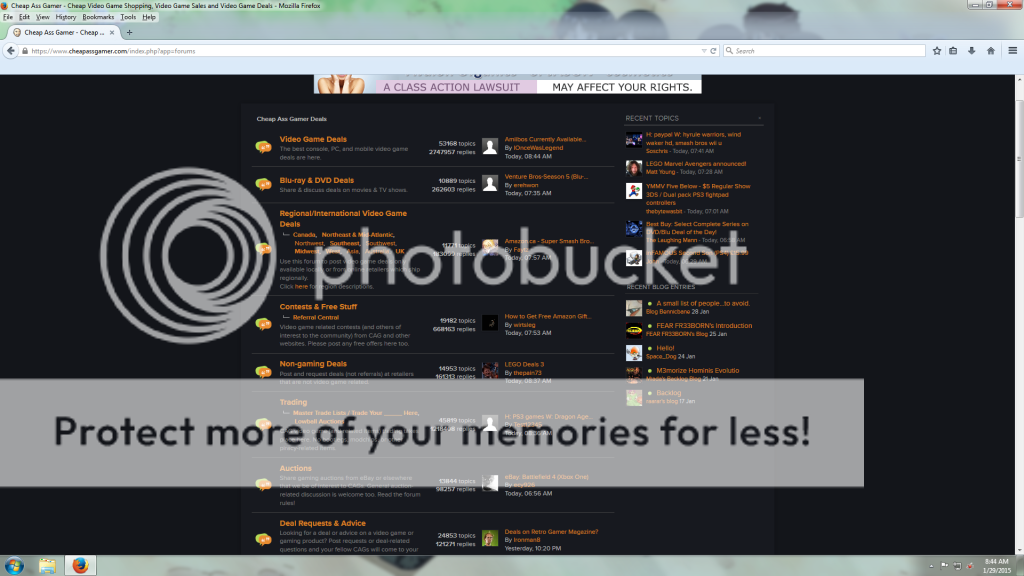
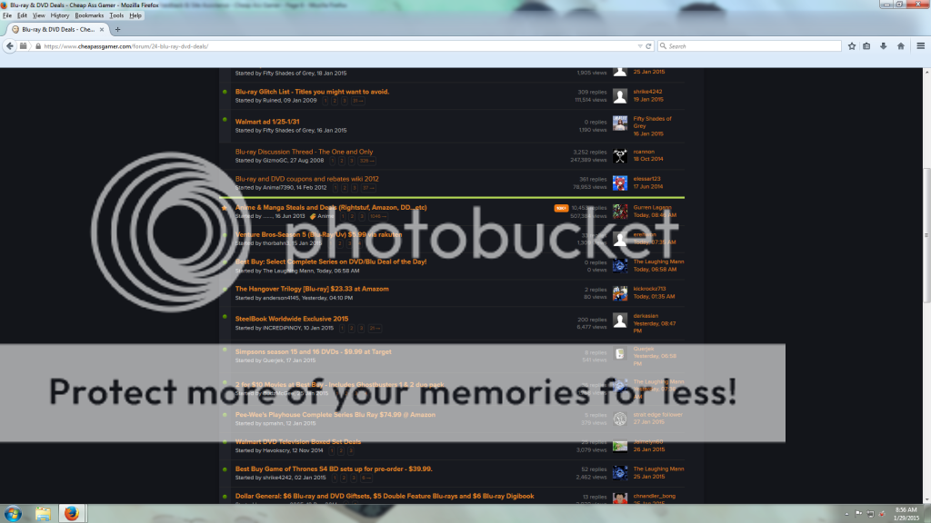
The main forum page is where I have the main issue with the font size, as you can see that the thread titles of recent post in each section of the forums are much, much smaller now, and I have to either move my face up to the screen, or squint a little to see it properly, which is definitely worse than before.
Inside each thread there doesn't seem to be a problem, but outside of the thread, looking at the layout, that is where the majority of the problems with text size is occurring for me, and makes it fairly more difficult to navigate from my perspective.
I am using Firefox 35.0.1, OS is Windows 7 platform.
Here are the screenshots of the forum layouts,
Also, did you look into the updating feature of new posts being posted while you're typing up a post, and not actually updating it after pressing the button? The feature may have been disabled as I don't see it popping up right now as I was typing this post, and there were several posts while I was typing this post.
But yes, the font in general just feel way too small now, in some ares the effects are more apparent, but some others it may not, but there are more areas that I've noticed where the font is smaller than there aren't, and it just seems that most parts where the font is not smaller are only because the bold seems to be stronger now, but when words are not bolded it seems to be incredibly small now, so not sure if that was by design or not, but I definitely notice the difference.
RogueSplinterCell
Banned
I'm digging this change
got it, thanks.The main forum page is where I have the main issue with the font size, as you can see that the thread titles of recent post in each section of the forums are much, much smaller now,
*snip*
Inside each thread there doesn't seem to be a problem
I'm sure John will take a lookAlso, did you look into the updating feature of new posts being posted while you're typing up a post, and not actually updating it after pressing the button? The feature may have been disabled as I don't see it popping up right now as I was typing this post, and there were several posts while I was typing this post.
Squarehard
CAGiversary!
- Feedback
- 182 (100%)
Also, quoting seems to have the same smaller font issue as well.

It almost feels like the two different font sizes are almost two sizes in difference.
It almost feels like the two different font sizes are almost two sizes in difference.
When in desktop mode - on my iPad - the left side (feedback, game collection) stats get cutoff. Pretty much anything to the left of everybody's avatar is cutoff.
Also, any chance you can make the 'Joined X years ago' stat to always be visible? Nice to see who are the rookies and who are the seasoned vets. Maybe I am the only one who cares. Dunno.
Also, any chance you can make the 'Joined X years ago' stat to always be visible? Nice to see who are the rookies and who are the seasoned vets. Maybe I am the only one who cares. Dunno.
thenutman69321
CAGiversary!
- Feedback
- 41 (100%)
Could not agree more with this. Improving performance is great but visually the site looks so much different again. We'll all get used to it I'm sure but IMO the site looks worse because of these changes.Ok, I change what I said, I do agree that the changes were minor, but, the minor changes add up to a lesser visual experience IMO. If performance is better, that's great, but visually, it's much worse, again IMO
elessar123
CAGiversary!
- Feedback
- 203 (100%)
Everything is just too damn small, and I'm on a 24" monitor, so that should really tell you that there is something wrong with this change. I'm not sure if you take into consideration of those who have poor eye sight, but I am one of those people, and it shouldn't have to be a struggle for me to see what people are posting on the forum.
Do me a favor Squarehard and screen cap the site and post it here. The changes were relatively minor, and in fact, the font got slightly bigger, not smaller.
Thanks.
Here's my feedback so far:
1) The fonts did get smaller for me. Only checking on my work PC for the moment (Win 8.1, Firefox 35.0.1) and the font is definitely smaller. Not an issue for me, as I'm OK with the change, though on my 1080p monitor, it's a noticeable change. Will try some other browsers later and see if it's browser specific.
Also on Firefox 35.0.1 Win7. I'm on a 17" monitor at the moment, and my eyes are hurting 1.5' away.The main forum page is where I have the main issue with the font size, as you can see that the thread titles of recent post in each section of the forums are much, much smaller now, and I have to either move my face up to the screen, or squint a little to see it properly, which is definitely worse than before.
Inside each thread there doesn't seem to be a problem, but outside of the thread, looking at the layout, that is where the majority of the problems with text size is occurring for me, and makes it fairly more difficult to navigate from my perspective.
I am using Firefox 35.0.1, OS is Windows 7 platform.
Physically, the entire width of the posts is about 7", with about 6.5" of unused width. I get less eye strain reading on my 4.7" phone.
As for other issues:
1) I don't notice the screen being darker either, but I don't usually have brightness up anyways.
2) I don't like how the name of the poster takes up more vertical space. It should have been just on the side, like it used to be.
3) Similarly, I don't like how much horizontal space is used up by user stats, which are more or less useless. I literally have 5.75" of text per line on the screen on this monitor. The stats could easily go under the avatar, or make everything mouse-over.
4) I don't like how much unused space there are on the sides. In total, like 45% of the screen is completely blank.
5) I don't know why we have to mouse over for the trading statistics, when the game stats are arguably less valuable. Maybe you're trying to make this a main trading site, especially since Goozex is gone. I don't know what the intentions are.
Edit: Forgot some things.
6) Please bring back the followed content thread. That's what I use 99% of the time.
7) I do like that it looks cleaner overall. Although I'm not a fan of the front page. It's too busy, and reminds me of the Windows 8 Start Screen. And you know how everyone loved that.
Last edited by a moderator:
How can you quick message another member? Previously, you would select 'send message' under their icon and a window would pop up. Now, you are taken to another page.
Edit: This has been fixed.
Edit: This has been fixed.
There has been a problem with that function for a few weeks at least.Also, the reveal the new post button doesn't seem to be working as I just tried it several times while I typed this message. I kept clicking it, it would disappear, seem like it would load something, and then it would pop up again to let me know there was that same new post that I can't seem to get to.
Does clicking the 'light switch' icon located on the top left of the toolbar help?Don't know if it's been mentioned, but this font color choice makes editing [customspoiler=extremely difficult.]
[/customspoiler]
Last edited by a moderator:
I for one would very much like to have one-click access to "What's New" back please.What happened to the "What's New" link on the top of the page that allowed you to bring up recent posts across all forums? IMO that is the only efficient way to navigate the site.
Edit: Never mind; there isn't a permanent "sticky" for it at the top of the site like before but it's under the "Forums" -----> "Quick Links" drop down menu.
I prefer not using the WYSIWYG editor. You can't see some of the sometimes lost/rogue formatting in that mode.Does clicking the 'light switch' icon located on the top left of the toolbar help?
Matt Young
CAGiversary!
- Feedback
- 8 (100%)
Clicking the main logo atop the forums brings me to the front page of the site rather than the forums, like it should. Please fix.
+1I for one would very much like to have one-click access to "What's New" back please.
Is there no way to hide front page panels? What I liked about the old layout was that the important things were all right up top when you loaded the page; on the left was the top deals list and the right was the CAG tweets. Now all that stuff is buried and lost below this extra stuff that I've never cared about like the Community blogs and collection stats. And there are huge gaps of empty space up top when the CAG maintenance block isn't hovered over (but that one could also be because I'm browsing the site on my phone -- desktop mode, I hate "mobile versions" of sites. )
Oh, and clicking on my icon in the top right corner does nothing but immediately log me out.
Oh, and clicking on my icon in the top right corner does nothing but immediately log me out.
Last edited by a moderator:
Same problem here.Clicking the main logo atop the forums brings me to the front page of the site rather than the forums, like it should. Please fix.
Retrogamer76
CAGiversary!
Yuck. The new design is ugly and annoying. It's worse than the Michael Bay Transformers movies.
Kidorangepanda
CAGiversary!
- Feedback
- 1 (100%)
I like the new look.
Awesome. Much appreciated.There's a new setting when editing your profile, "Include "What's New" in Navigation".
I don't have the greatest setup but it looks to me like the blacks are washed out... almost as if I'm squinting through tired or dry eyes. That is my only other complaint.
Windows 8.1 using Chrome
chnandler_bong
Official? CAG Headless Mad Comber of Comb Mountain
- Feedback
- 482 (100%)
I think I like the new forums layout (don't use much else yet, but I'm starting to expand my horizons). I will miss the old dark blocky background, but this new look is nice and clean. Good job so far!
Yay! I'm finally able to add my PS4 games to my collection.
I'm having the same issue. Is there a way to get to our profile without having to search for one of our posts.Also
Selecting my profile (pic) in the top right just makes me sign out.....
Hover over "forums" at the top of the page, to the right is "Quick Links", under that is "My Profile".Is there a way to get to our profile without having to search for one of our posts.
Last edited by a moderator:
!!sknahtHover over "forums" at the top of the page, to the right is "Quick Links", under that is "My Profile".
chnandler_bong
Official? CAG Headless Mad Comber of Comb Mountain
- Feedback
- 482 (100%)
I found what could be a (minor) quirk. When I hover over someone's feedback percentage in a forum post it auto expands and shows their positive and negative numbers. It doesn't do that in a conversation, is that intended? If someone starts a convo with me I'd like to be able to see their numbers in that convo instead of having to go out and check.
Glass_Ghost_0
Banned
Seems to be a problem with viewing embedded pics?
When I select the pic, just makes everything darker but doesn't actually display the pic
When I select the pic, just makes everything darker but doesn't actually display the pic
elessar123
CAGiversary!
- Feedback
- 203 (100%)
It shows the pic somewhere on the page (usually on the bottom), but it's still darkened.Seems to be a problem with viewing embedded pics?
When I select the pic, just makes everything darker but doesn't actually display the pic
Glass_Ghost_0
Banned
That's what I thought was happened buy no matter where I looked, no pic was being showIt shows the pic somewhere on the page (usually on the bottom), but it's still darkened.
Just noticed also that the full site on mobile also cuts off a significant portion of the left and right sides of the page. Like, half of most people's usernames are gone and the site won't allow you to either zoom out all the way to see the edges or even scroll over to see what's being cut off.
Last edited by a moderator:
bread's done