Sega Saturn Slim DVD Cover Project [98 Covers and Growing / 56K beware!]

I'll send you my 600 (!) dpi scans of PDS, Rayearth, and Albert Odyssey (the latter two don't look that great on the backs though... damn Working Designs and their damn foil lettering), and if they're rejected, I'll try it again. Expect some scans (and maybe a Rayearth concept cover) this afternoon.
 
[quote name='durkada']FYI -- for the Photoshop impaired, or the Winders challenged:

The Gimp can read and write PSD image format. At some point, I think the Gimp surpassed Photoshop in terms of power and GUI comfort -- probably about 3 to 4 years ago. At least, I'm more comfortable with it. So, if you don't have Photoshop, or prefer to stay away from the confines of Winders and Mac OS, give it a whirl. The Gimp has been ported to Winders, Mac, Solaris, FreedBSD, etc. etc. etc.[/quote]

:lol: I think you may be in the minority with Gimp surpassing Photoshop... I cant even use Gimp in most of my graphical work.
 
[quote name='Sailorneorune']crappy low-res preview version of the Rayearth cover:

http://img.photobucket.com/albums/v31/sailorneorune/cagrayearthpreview.jpg

let me know if it's worthy of sending the zipped Photoshop file.[/quote]

Just to chip in, I think its very pretty. The only thing I'd like to see different is the logo on the front -- I think it would be nicer without the white space around it, and a tad larger.

If you are having problems finding a logo to scale, you could use the autotrace function in Inkscape to convert it to vector first. I did that with several PSX games to good results.
 
Thanks Durkada. I'll try that. Another thing that bothers me though: the Working Designs foil lettering had its way with my scanner... any advice for correcting that?
 
[quote name='Sailorneorune']Thanks Durkada. I'll try that. Another thing that bothers me though: the Working Designs foil lettering had its way with my scanner... any advice for correcting that?[/quote]

I can only guess, from the small jpeg you referenced, that the foil lettering is the game description found on the back cover?

In that case, there are some things you can do. If you have a semi transparent material to dullen the scan, you could use that over the image. But really, I wouldn't bother with another scan.

What I would do is simply rebuild the text. Just find a font you like, and transcribe. If the foil text ruined much of the surrounding artwork, simply cover that portion up and rescan the rest of the document.

If you'd like, you can send me a larger copy of the back and I'll take a quick stab at it. PM, if you like, for my leetul email addy.

Cheers,
Jon
 
One more -- GridRunner. Again, only the manual -- so, in this case I had to deal with what I did not have. I used the only scan I could find of a back cover, in this case a Euro version, and made an attempt to clean it up. The front cover scan had a game review text overlapping the art which I removed.

BTW -- Grid Runner is a fairly enjoyable arcade game!

It was hard to discern whether some of the dots in the artwork were supposed to be stars behind the colorful explosion, or if they were simply the by-product of bad screenprinting! I removed some, left others in.


grsmall.jpg
 
Okay, in the spirit of posting covers, I would like to show off my premier contribution.

soukyugurentai_web.jpg


As opposed to sticking with what art was available, I modified existing assets to create the cover that I would envision for Soukyugurentai.

It is different, but I hope some of you might like it! Obviously, I am very open to crits, both positive and negative.

A larger version (very not high-res) is available here.
 
Durkada - you guessed right... I may just transcribe the text from the cover. Also, about your Inkscape suggestion... I was thinking of tracing the large Rayearth logo from the back cover and using that... should I try something different. Also, I may require assistance doing that. I haven't touched Photoshop in a while, and this is the first I've heard of Inkscape.

No wonder the Photoshop-proficient run circles around me on DeviantArt... gah. :(

/Photoshop-challenged
//does all art by hand
///next cover butchering: Panzer Dragoon Saga
 
[quote name='roos']
As opposed to sticking with what art was available, I modified existing assets to create the cover that I would envision for Soukyugurentai.

It is different, but I hope some of you might like it! Obviously, I am very open to crits, both positive and negative.

A larger version (very not high-res) is available here.[/quote]

In the spirit of commenting on whatever gets posted, I love this! For my own part, I like it when people use their imagination to create something new and attractive. Afterall, as no Saturn game was released in a slim dvd case, none of these can claim absolute fidelity to the originals.
 
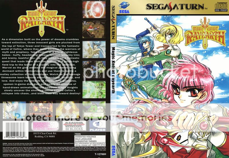
[quote name='Sailorneorune']Durkada - you guessed right... I may just transcribe the text from the cover. Also, about your Inkscape suggestion... I was thinking of tracing the large Rayearth logo from the back cover and using that... should I try something different. Also, I may require assistance doing that. I haven't touched Photoshop in a while, and this is the first I've heard of Inkscape.

No wonder the Photoshop-proficient run circles around me on DeviantArt... gah. :(

/Photoshop-challenged
//does all art by hand
///next cover butchering: Panzer Dragoon Saga[/quote]

Inkscape: install it. Has a Windows port, or is native for Linux, if thats the flavor of your goat.

Once installed, go to file and import bitmap. This should be the logo -- preferrably, you would have already cropped it and removed unnecessary background imaging from it using Photoshop or whatever.

At this point, the graphic you imported should be selected -- if not, click on it.

>Path>Trace Bitmap. Here, you have a series of methods for tracing the bitmap. Fortunately logos have a limited number of colors, as this isn't the best tool with alot of unique colors. Anyway, your best bet is usually choosing Multiple Scanning and Color. The number of passes you choose causes more detail to be picked up -- I often remove Smoothing as an option. This can be memory and time intensive if you choose a great many passes. Ultimately, you should experiment with the tool to determine which tracing method produces the results you desire.

The only trick to this is that it will create the rendered image over the bitmap on the screen. You can click and expand the corner of the new image to enlarge it, using control+click to maintain the ratio as you drag the image. Don't like it? Press delete, reclick the original bitmap, and try again.

Once you are happy, go to File-->Export Bitmap. Save it as a jpeg, or whatever. The more pixels you choose during this process, the larger the image will be. Because you are exporting a vector to bitmap, whatever resolution you choose should be perfectly smooth. Rule of thumb: export the image using a lot of pixels in Inkscape, and scale it down in Photoshop. Everything should be purty at that point.
 
[quote name='Mookyjooky']:lol: I think you may be in the minority with Gimp surpassing Photoshop... I cant even use Gimp in most of my graphical work.[/quote]
I'm certainly in the minority, but for me, Photoshop is a cumbersome exercise in frustration.

Regardless, I wanted to make a comment regarding the original template. I would make a suggestion -- have two Side Bar layers. The first one, automatically visible and maintaing the present sidebar. The second, no semitransparent white area with only the Sega logo visible on the bottom. Thus, people could choose to make only the second visible, reverse the font to white and have a pure black background.

This may be a limitation of the Gimp, but I can't seem to isolate the white from the Sega logo with any good affect. Its seeing the transluscent white a part of the overall whiteness, including that of the logo itself. I fired up Photoshop to the same general effect, but I clearly don't know what the hell I'm doing in that program to be certain. Its as if the sega logo and transluscent bar were two layers, now merged, and its impossible to cleanly seperate them -- due to the similarity of the RGB values.

Cropping out the logo by hand has been ... dissastisfying. Or, again, maybe I'm too anal -- I'm trying to make the crop look exactly like the original, and there are some issues with the anti-aliasing for it to work properly.

Update: cropped it by hand and looking good ;) Still would be nice to have a standard layer for everyone.
 
durkada - thanks again for the wonderful advice... I'll try to get an improved Rayearth concept cover on my photobucket as well as a Panzer Dragoon Saga concept cover.

It's the least I could do to give back to the Sega lovers community for the kickass Saturn deals I've been blessed with lately.
 
Hopefully this will be my last post for the day.

Included is an updated Grid Runner -- looking better, me thinks, without the transluscent whiteness.

grbsmall.jpg


For anyone who wants it -- I saved two layers you can easily import into your own work. These layers consist of the white text in standard font and size, and also of a Sidebar layer consisting only of the lower Sega logo in the appropriate spot. Photoshop format for universal lovin'.

http://durkada.stevemv.com/NoBar_WhiteText.psd
 
After taking the feedback from everyone into consideration, allow me to present Magic Knight Rayearth concept cover, version 2.0:

mkrcagpreviewmkII.jpg


More feedback will be appreciated. I'd like this to be worthy of the CAG Saturn Slim DVD Case Project.
 
Nice cover. Seeing all these nice covers make me wish I could find some of these games. I've managed to find a ton of genesis games in my area and greatly increased my collection, but even finding a saturn or sega cd game in this area is about as common as finding a unicorn.

One thing I was wondering is what cover I should work on next? It looks like everyone done all the covers for the game that I have. Do we have a list of completed and not completed covers?
 
[quote name='Sailorneorune']After taking the feedback from everyone into consideration, allow me to present Magic Knight Rayearth concept cover, version 2.0:

More feedback will be appreciated. I'd like this to be worthy of the CAG Saturn Slim DVD Case Project.[/quote]
Congrats! That looks much better! Without seeing the full blow cover, the only thing I would critique is the blurb on the back cover. The new text is immensely legible, which is awesome -- I just think it would look a bit better with the text justified. Other than that, bravo!

Oh yeah, and I'd clean up the one dotting blemish above the left sword hilt on the back cover ;)
 
[quote name='erehwon']Nice cover. Seeing all these nice covers make me wish I could find some of these games. I've managed to find a ton of genesis games in my area and greatly increased my collection, but even finding a saturn or sega cd game in this area is about as common as finding a unicorn.

One thing I was wondering is what cover I should work on next? It looks like everyone done all the covers for the game that I have. Do we have a list of completed and not completed covers?[/quote]

There is some site -- I don't have it bookmarked -- which has a huge amount of Saturn ISO images uploaded to the various file sharing web servers of the world.

http://www.saurianunderground.com/saturn/index.html Has a list of the completed covers on the right. If its not on the list, you can assume it hasn't been completed. That link also has refernces to other resources for Saturn artwork scans. Your mileage will vary from site to site and cover to cover...
 
I had to add that text line-by-line because Photoshop double-spaced every line I tried to type in, not leaving me enough room to get it all in... I'll give it one more shot after work today.

Didn't notice the dot... ^^;;;
 
wow.... just finally decided to start scanning....and well, not as easy as i thought... but then again... i'm a quality whore :( it took an hour for me to find the scanner settings that produced the best results... then trying to get everything to fit.... oh well.... i have roughly 12 on me now that i'm scanning and can't wait to finish and post.

i should have 17 covers tonight (8 games, 1 is a 2-disc game, 2 are 4 disc games) if i had a multidisc template (2 or 4 disc) then that would be easier....
 
Ok, so here is my first decent contribution to the project (low quality version)

lunar2sm.jpg


I have not used photoshop in quite a while, so if anyone has any suggestions, feel free to give them to me.
 
Ashram - a 4-disc cover? Please don't tell me you're doing Panzer Dragoon Saga. I want to do Panzer Dragoon Saga. :(

*sulks and goes off to work on the Rayearth cover*
 
did panzer saga and enemy zero, but i say go for it....different variants are always cool...
also was working on rayearth, but my scanner left a line on the cover (the enbossed foil title) and my scanner was BARELY able to pickup the foil text on the back.
 
well, then, I guess there will be 2 Panzer Dragoon Saga covers.

I couldn't do anything with the front logo on Rayearth, or find a high-res picture of the Clamp art used for the cover, so that's why the one that's on there is on there... that, and I like it.
 
[quote name='Weedy649']With so many e-mails chances are his inbox could have gotten full.[/quote]

Exactly what happened, my email box has been full for a week, I just fixed it.

Also, I'm working through scanning 200-300+ covers for upload, anyone want to host it? I think front/back/side at 300dpi... their .tifs - but I can convert to .jpg.

21 megs per game at .tif

but a minor quality loss gets us -

13 megs per game at .jpg at 12 Quality Setting
and 9 megs per game at .jpg at 11 Quality Setting

What'ya guys think?
 
[quote name='durkada']Hopefully this will be my last post for the day.

Included is an updated Grid Runner -- looking better, me thinks, without the transluscent whiteness.

grbsmall.jpg


For anyone who wants it -- I saved two layers you can easily import into your own work. These layers consist of the white text in standard font and size, and also of a Sidebar layer consisting only of the lower Sega logo in the appropriate spot. Photoshop format for universal lovin'.

http://durkada.stevemv.com/NoBar_WhiteText.psd[/quote]

Sounds good, but lets try to keep them all the same for now, as far as the black bar variation goes, I can create a photoshop action to change that for all the people who want that changed at the end of the contest.

I've already created a Euro/US cover version action... that'll auto convert all of them into whatever region someone desires.
 
pretty soon me a Saurian are gonna have to figure out which ones need cleaner scans... at least of the backs... not being able to read the text is a pain in the ass.

Also, I want to thank everyone for working on the project, and apologize for not really being here this week. Work has been insane. And a special thank you to Saurian who's running the show in my absence perfectly.
 
Last post before I go, make as many variations of a game cover as you want, and dont forget the crappy games... =)

Thanks guys!
Peace.
 
[quote name='Mookyjooky']Exactly what happened, my email box has been full for a week, I just fixed it.

Also, I'm working through scanning 200-300+ covers for upload, anyone want to host it? I think front/back/side at 300dpi... their .tifs - but I can convert to .jpg.

21 megs per game at .tif

but a minor quality loss gets us -

13 megs per game at .jpg at 12 Quality Setting
and 9 megs per game at .jpg at 11 Quality Setting

What'ya guys think?[/quote]

Definatly a good idea on the scans. Some of the backs (and even fronts) available online are severely lacking in quality.
 
[quote name='durkada']There is some site -- I don't have it bookmarked -- which has a huge amount of Saturn ISO images uploaded to the various file sharing web servers of the world. [/quote]

I believe the site you are referring to is snesorama.us which has a pretty good selection of games for many systems. I've had very good luck with their Saturn CD images, which is much more than i can say for ed2k and bittorrent.

But that's off-topic. :whistle2:D

As i mentioned in a previous post, i plan on hosting whatever scans are sent to me. The post must have gotten lost in the shuffle. A prime example of a reason to use a new forum.

Oh, but you guys don't know about that yet...hehe.

There will be a forum for the project on the Saurian Underground site, with separate boards for different aspects. Later tonight, when i'm sure i've gotten everything working properly, i'll open it up for all to use. It's not an official replacement until i get a final OK from Mooky, but everyone's welcome to sign up.

I plan on rebuilding the site to include a better cover gallery and the scan hosting i mentioned. As the proverbial icing on the cake, all of our resources will be in one place, easy to find. (Note that i will not host existing scans from other sites without an OK from them, so if you're submitting scans, please make them your own. Again, those can be uploaded to saurianoverlord on MediaMax.com for the time being.)
 
OK everyone, like i said, it's not officially replacing this thread just yet, but here it is:

http://www.saurianunderground.com/forum/

Feel free to sign up and start posting any time! I've tried to put most of the important info up for now. I need to update the list on the main project page, and i've posted links in the forum to a "Scans" page that does not yet exist. I also would like to change some details of the forum interface (some of the buttons and icons and such, mainly). But i need to sleep, so it's not gonna happen tonight...lol.

If anyone has ideas for improvements, or sees something important i missed, send me an e-mail or PM me on either forum.

~robert
 
so are these completed covers actually hosted somewhere, so that anyone can download them?

I love the idea of teh project, but i like keeping my games in their original cases. i have 5 or 6 US saturn games, but since i started living in japan in september, i've bought almost 60 import games. Thanks to the CD case, they actually look quite good on my shelves.. i prefer them to the slim dvd cases.. then they'll complement my ps1 library better.

but whatever... that's my take on the subject.

When i get back to the states in January i'll probably hop on board and scan in all the booklets and cd covers to help out with the project. here are the games i currently own on the saturn: http://theschlock.com/misc/games2.html?sat?text
 
I would love to contribute but I know I don't have the time or resources currently. Maybe someday.

Anyway, a couple suggestions. When thinking about these nice, clear, high-res slimline cases on my shelf, I'd love to have a white US template for my US games, a black EUR template for the euro games, and a golden JAP template for the Japanese games I own. I just think that lined up sitting on a shelf, distinguishing the games by region makes the collection look a bit more "authentic" as well as mixes it up a bit.

Another concern is the inconsistency of the back/front covers. Just speaking from personal preference here, but I would hate to have a US version of NiGHTS with the european logos on the back. The art is not a big deal (because looking cool is the most important thing in my book), but the actual icons, like the sega quality, backup unit, 6-player adapter, 3D control pad, ratings, etc... I feel that those should stay within the bounds of their region. If I put my US version of NiGHTS in a custom case with the white template around it, I don't want the Japanese ratings or info boxes on the back, I want the US 3D control pad logo and the ESRB rating box.

Anyway, the point of this is not to complain or gripe because I think this project is awesome and I will definetly be happy as a clam when it is completed, but rather to provide some suggestions. Maybe provide high quality scans of the logos to add as static objects? I'm not familiar with PS terminology so I don't know if this is possible, but you know.

anyway sorry for the rant, I sometimes get that I'm a little long-winded.

kudos on the project and everything looks spectacular thus far!


ps. ever thought about doing double sided covers for clear slimline case? just a thought :)
 
[quote name='amil_mcw']
Anyway, a couple suggestions. When thinking about these nice, clear, high-res slimline cases on my shelf, I'd love to have a white US template for my US games, a black EUR template for the euro games, and a golden JAP template for the Japanese games I own. I just think that lined up sitting on a shelf, distinguishing the games by region makes the collection look a bit more "authentic" as well as mixes it up a bit. [/quote]Read up thread . . . Mooky has made a Photoshop action that can change the header/logos to US or Euro. :cool:
 
[quote name='amil_mcw']ahhh.. thought I read the whole thing, guess not :roll:

thanks!

now just about the graphics schemes on the back... hm.[/quote]

The thread is now 10 pages long! Surely you can't be expected to read and reference every post.

Cause, if you had, you'd be hopping on the new forums at http://www.saurianunderground.com/forum/ ;)
 
[quote name='ashram']wow.... just finally decided to start scanning....and well, not as easy as i thought... but then again... i'm a quality whore :( it took an hour for me to find the scanner settings that produced the best results...[/quote]

I just came across a post about this project thanks to racketboy's site, and after briefly skimming over this thread I've noticed this common confusion on scan quality.

It's best to scan at a very high resolution, 300 dpi being the standard minimum for a good quality print. However your image sources are printed materials, and scanning them at high resolution is just making the printed dot patterns visible. I'm not going to write out a tutorial on how to remove moire patterns from scans, but it isn't that complicated but does require patience to get a high quality end product. Photoshop is essentially required for this process. It is in your best interest to avoid using the scanned text from the game booklets, and instead retyping it out in a program like InDesign instead of within Photoshop. Not saying it can't be done, just that the flexibility and results are better suited for InDesign over Photoshop.

I'm in my four year of University for Graphic Design, so this type of work has been covered in my course work as well as in employment.

It's nice to see that a project like this exists, and I hope to contribute to it soon.
 
[quote name='amil_mcw']ahhh.. thought I read the whole thing, guess not :roll:

thanks!

now just about the graphics schemes on the back... hm.[/quote]

Well, think the main issue, is that if you created a project that was extremely anal retentive and made people recreate their favorite game covers with a completely different layout, or a fully standardized layout scheme with 50+ layers or so... you'd have only 5 people contributing to the project with an output of 2 a year a peice.

Trust me, I would love to customly design this project all the way down to the smallest point, but you have to factor in that 75% of the people looking at this thread dont know about photoshop as much as I do. So I wanted to create a contest non-designers can get in on.

And honestly, I'll have to say... theres been about 5-10 graphic designers out there telling me they'd love to get in on this project, but the only people submitting are just the average joes who just want to get in on making stuff and learning photoshop. I'm an ex-graphic designer myself, and I can make a cover in less than 20 mins, and when I'm feeling crazy and I'm just copying the format and transporting it to our standard format, I can create a photoshop action and create 10-20 in a matter of 30 mins. So you'd figure that it'd be easier for the graphic designers.

This project is designed so you can be that change you so desire... if you want to work with special back layouts and be totally anal retentive of the design... I completely support that... as long as you stick with the small original layout we have going here.

I'm excited to see what you'll bring to the project, and I hope to see something soon!

Thanks!
~Wes
 
[quote name='SBM']My first attempt at making a cover.

[/quote]

looks great, just please put a little info about the game on the back... a scan of the back cover works great, and you can rotate the "roommate" logo clockwise and put it above it. And just fix the text (its centered, but the template is set to the left, please match the template design)

Fix those and I'll add it to the collective.
 
Just got the PM, this has come a long way! Still in crunch time at school though, lots due next week then finals the week after. Then ill immerse myself in all that ive missed, and get going on this.
 
Games/booklets that I have and will scan sometime within the coming weeks:

X-Men vs. Street Fighter (JP)
Dracula X (JP)
Panzer Dragoon (US)
Panzer Dragoon Zwei (JP)
Panzer Dragoon Saga (JP & US)

I agree with the comment about having a template with territory specific identifications, be it the Saturn logo, age rating, etc. I have yet to look at the templates, but I did see that there apparently are some options for the other territories in an updated template.

This mostly comes from the fact that I own a decent amount of games, import and domestic, and would like to house them in their respective territory specific cases.

As for what game I would like to tackle, my eye is on the Panzer Dragoon trilogy, complete with a housing unit for the full three games. I'll be waiting until school ends for this semester before getting down to business.
 
Just wanted to let everyone know, I hope you didnt let Ten10's 50-60 covers scare you away, he's not getting the Saturn. He doesnt want it.

What that means, is that someone could sit down for probably 2-3 hours this weekend and be in the lead for the Saturn. Just remember, you'll come to love these covers, when you get the Saturn, as I've packed 50-100 (or more) case-less games in with it. You'll be wanting to get those covers then for sure when you win.

All the Panzer Dragoons, Raident Silvergun, almost All the capcom games, almost all the 2d Shumps are in the mix as well.

And I'm adding more as I'm getting more, burning 2 cd's everytime I burn one. I'll post pictures this weekend.
 
bread's done
Back
Top